

Why a Mid-Year Report
January trend forecasts are easy to write and easy to forget. June is when the truth arrives. Six months into 2026, some directions have already burned through their moment, while others have settled into the way high-end kitchens are actually being designed, specified, and built.
There is a version of "trend" that is purely cyclical: a colour or material that rises to saturation and disappears. Interior media is full of these. And then there is something else: a design direction that reflects a genuine shift in how people want to live and what quality looks like at a particular moment.
The seven directions below belong to the second category. Every one of them has done more than survive the first half of the year. Each is gaining momentum in the projects on our 2027 boards, including the work happening in Ottawa homes.
Trend 01
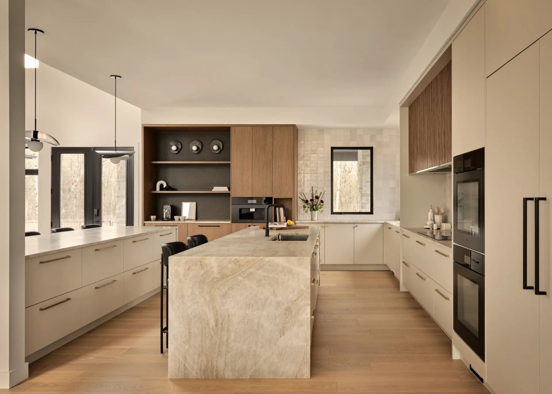
Warm-Toned Natural Stone: Quartzite Leads

For the past several years, the dominant stone in luxury kitchen design has been white marble. Specifically, the dramatic veining of Calacatta Borghini or the soft movement of Statuario. These remain beautiful materials.
But the conversation has shifted decisively toward warmer-toned stone: quartzite in honey and cream tones, materials like White Macaubas or Taj Mahal. Where white marble reads crisp and editorial, warm-toned natural stone reads alive. It has depth. It works with wood tones and brass hardware, and with the warmer palette that has replaced the cool grey and white interiors of the last decade.
Into 2027: Expect quartzite to remain the lead specification while travertine moves beyond the backsplash into islands and integrated sinks.
Trend 02
Unlacquered and Aged Brass: The Material That Gets Better with Time

The hardware conversation in luxury kitchens has moved decisively toward unlacquered brass and aged brass finishes, and for reasons that go beyond aesthetics.
Polished chrome and brushed nickel are static finishes. They look the same in year one as they do in year ten, which is not necessarily an advantage. Unlacquered brass is a living material. It oxidizes and softens, developing a patina that is entirely personal to the household. This is a shift in values as much as in taste: a preference for materials that develop character over materials that maintain a perfected surface.
Aged brass and brushed brass are the more maintenance-conscious versions of this direction. They carry the warmth and visual weight of unlacquered brass without the daily evolution. For homeowners who want the aesthetic without the commitment, they are an excellent alternative.
Into 2027: Living finishes extend beyond hardware to faucetry and pot fillers, with full brass suites specified from a single maker for consistent patina.
Trend 03
Integrated Appliances: The Flush, Seamless Kitchen Panel

The integrated appliance direction has been building for several years, and by the midpoint of 2026, it has become the definitive choice in high-end kitchen design. The goal is simple: appliances that disappear into the cabinetry, producing a kitchen that reads as pure architecture. Panel-ready refrigerators and dishwashers, and increasingly, ventilation systems as well, mean that the kitchen's face can be a continuous surface of cabinetry or stone, uninterrupted by stainless steel.
The most sophisticated versions extend to range ventilation, where custom millwork hoods replace the commercial-style stainless hoods of the 2010s. A painted or lacquered hood that matches the cabinetry, trimmed with minimal brass detail, is a significantly more refined choice.
The integrated kitchen is not about hiding appliances for the sake of minimalism. It is about allowing the design itself to be the focus, undistracted by utilitarian objects.
Into 2027: Integration reaches coffee systems and wine storage, with entire working walls reading as millwork.
Trend 04
Statement Lighting: Pendants as Architecture, Not Just Illumination

The island pendant has always been a kitchen statement. This year, that statement has grown larger, more sculptural, and unmistakably architectural. We are seeing pendants that serve as the primary design object in the room: large-scale glass-and-metal forms or organic handblown shapes that command attention the way a piece of art would. The pendant is no longer selected to complement the kitchen. It is selected to anchor it.
This trend comes with a caveat: scale matters enormously. An oversized pendant on a small island can overwhelm the space. An undersized pendant on a generous island disappears. The rule of thumb, pendant diameter at approximately one-third of the island's width, is a starting point rather than a formula. Ceiling height and the pendant's visual weight factor in as well.
The most successful statement pendants we are specifying right now have warmth: amber glass and aged brass arms, materials that read differently in morning light than at a dinner gathering.
Into 2027: Expect plaster and ceramic pendants to join glass and brass as the sculptural materials of choice.
Trend 05
Fluted Details: Vertical Texture on Islands and Millwork

The fluted detail, vertical reeding applied to islands and panel fronts, has moved from an accent element to a defining feature of luxury kitchen design. Where the last decade prized smooth, flat surfaces, the current direction is unambiguously toward texture. Fluting works on painted lacquer islands and refrigerator panels alike, and it works in stone: fluted stone islands are appearing in the most photographed kitchens in North America right now.
The key to executing fluted detail well is proportion: the width and depth of each channel, and its relationship to the overall scale of the panel. Too fine and it reads as decorative noise. Too coarse, and it overwhelms. When calibrated correctly, it brings the feeling of millwork craftsmanship that high-end clients have always wanted from their kitchens.
Into 2027: Fluting matures from feature to vocabulary, appearing in stone and wood at varying scales within the same kitchen.
Trend 06
Two-Tone Cabinetry: Contrast Used with Intention

The all-white kitchen has not disappeared. But the most interesting kitchens being designed right now use contrast intentionally and with precision. The most prevalent expression is a two-tone palette: perimeter cabinetry in a lighter tone, such as warm white or soft greige, paired with an island in a deeper shade, such as charcoal or forest green. The island becomes a piece of furniture within the kitchen, a defined object rather than a continuation of the cabinetry line.
The alternative approach, lighter upper cabinets against a deeper lower cabinet, plays with visual weight and proportion. It grounds the kitchen, visually anchoring the base while keeping the upper half of the room light and expansive.
Both approaches work when the colour relationship is taken into account. The tones must relate through undertone and value rather than simply contrast. A designer's eye matters here: two colours that look appealing in separate samples can clash in full installation if their undertones are misaligned.
Into 2027: The palette deepens. Expect richer earth tones, such as oxblood and warm umber, to join green and navy in island programs.
Trend 07
Curated Open Shelving: Organization Visible by Design

The wellness movement in interior design has had a quieter but meaningful effect on how kitchens are organized. The open shelving that became ubiquitous in the 2010s has evolved: it is no longer about exposing storage but about curating objects that deserve to be seen. Ceramics, and considered cookware, are displayed with the same intention one would bring to styling a living room. The kitchen becomes a space that expresses the household's aesthetic rather than simply serving it.
This extends to glass-front cabinetry: not the practical glass doors of previous decades, but thoughtfully sized display areas lit from within, holding objects selected for their visual quality as much as their utility. The design principle is curation, not abundance. Less, better. Displayed with intention and lit appropriately.
Into 2027: Lit display cabinetry becomes a standard line item in high-end kitchen budgets rather than an upgrade.
Trends That Will Still Feel Right in 2030
What unifies these seven directions and explains their staying power at the midpoint of 2026 is a shared value: quality over novelty. Each is rooted in materiality and craft, and in the desire for spaces that develop meaning over time rather than dating the moment they were completed.
Warm stone that develops patina. Brass that ages into something personal. Architecture that prioritizes the design over the object within it. Texture that speaks to handcraft. Colour that is confident without being reactive.
These are the kitchens that will carry into 2027 and still feel right in 2030. Possibly in 2040.
At Astro Design Inc., we have been designing kitchens in Ottawa for thirty years. These directions are consistent with how we have always approached design: materials chosen for permanence and details calibrated for daily life, in spaces that improve with time.
See These Trends Come to Life
Follow us, subscribe, or if you are ready to start, book a complimentary consultation to discuss your kitchen at astrodesigninc.com/book-a-consultation


